CircuitPython Slider Library
slider
A slider widget with a rectangular shape.
Author(s): Jose David M.
Implementation Notes
Hardware:
Software and Dependencies:
Adafruit CircuitPython firmware for the supported boards: https://github.com/adafruit/circuitpython/releases
- class slider.Slider(*args: Any, **kwargs: Any)[source]
- Parameters:
x (int) – pixel position, defaults to 0
y (int) – pixel position, defaults to 0
width (int) – width of the slider in pixels. It is recommended to use 100 the height will auto-size relative to the width. Defaults to
100height (int) – height of the slider in pixels, defaults to 40 pixels
touch_padding (int) – the width of an additional border surrounding the switch that extends the touch response boundary, defaults to 0
anchor_point (Tuple[float, float]) – starting point for the annotation line, where
anchor_pointis an (A,B) tuple in relative units of the size of the widget, for example (0.0, 0.0) is the upper left corner, and (1.0, 1.0) is the lower right corner of the widget. Ifanchor_pointisNone, thenanchored_positionis used to set the annotation line starting point, in widget size relative units. Defaults to(0.0, 0.0)anchored_position (Tuple[int, int]) – pixel position starting point for the annotation line where
anchored_positionis an (x,y) tuple in pixel units relative to the upper left corner of the widget, in pixel units (default is None).fill_color – (RGB tuple or 24-bit hex value) slider fill color, default is
(66, 44, 66)gray.outline_color – (RGB tuple or 24-bit hex value) slider outline color, default is
(30, 30, 30)dark gray.background_color – (RGB tuple or 24-bit hex value) background color, default is
(255, 255, 255)whiteswitch_stroke (int) – outline stroke width for the switch and background, in pixels, default is 2
value (Boolean) – the initial value for the switch, default is False
minimum_value – the minimum value for the slider, default is 0
maximum_value – the maximum value for the slider, default is 100
Quickstart: Importing and using Slider
Here is one way of importing the
Sliderclass so you can use it as the nameSlider:from adafruit_displayio_layout.widgets.slider import Slider
Now you can create a Slider at pixel position x=20, y=30 using:
my_slider=Slider(x=20, y=30)
Once your setup your display, you can now add
my_sliderto your display using:display.show(my_slider) # add the group to the display
If you want to have multiple display elements, you can create a group and then append the slider and the other elements to the group. Then, you can add the full group to the display as in this example:
my_slider= Slider(20, 30)
my_group = displayio.Group() # make a group
my_group.append(my_slider) # Add my_slider to the group

#
# Append other display elements to the group
#

display.show(my_group) # add the group to the display
Summary: Slider Features and input variables
The
Sliderwidget has some options for controlling its position, visible appearance, and value through a collection of input variables:position:
x,yoranchor_pointandanchored_positionsize:
widthandheight(recommend to leaveheight= None to use preferred aspect ratio)switch color:
fill_color,outline_colorbackground color:
background_colorlinewidths:
switch_strokevalue: Set
valueto the initial value (True or False)touch boundaries:
touch_paddingdefines the number of additional pixels surrounding the switch that should respond to a touch. (Note: Thetouch_paddingvariable updates thetouch_boundaryControl class variable. The definition of thetouch_boundaryis used to determine the region on the Widget that returnsTruein thewhen_insidefunction.)range:
minimum_valueandmaximum_valuedefine the range of the slider
The Slider Widget
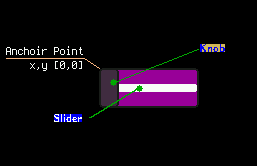
This is a diagram of a slider with component parts
- static transform(oldrangemin: float | int, oldrangemax: float | int, newrangemin: float | int, newrangemax: float | int, value: float | int) float | int[source]
This function converts the original value into a new defined value in the new range :param int|float oldrangemin: minimum of the original range :param int|float oldrangemax: maximum of the original range :param int|float newrangemin: minimum of the new range :param int|float newrangemax: maximum of the new range :param int|float value: value to be converted :return int|float: converted value